Netflix Sign Up for Mobile
& Responsive Web
Reinventing Netflix’s core sign up experience.
My Role
I served as the Lead Product Designer for Netflix's primary acquisition pages and sign-up process, including payment processing across mobile, web, and TV UI. The key product metric was improving sign-up conversion rates.
Project Importance
After spending significant time working in the growth and acquisition space at Netflix, I pitched this project, recognizing a significant opportunity to address issues affecting both customers and the company.
I heavily focused on on the emotional state of the user to really understand their core needs and create an optimal user experience.
The project also aimed to enhance design efficiency within the Product Design team.
Teams Involved
Product Design, Product, UX Research, Marketing, Front and Back-end Engineering, Legal, Payments, and various executives.
Success metrics
Increase partial and full sign-ups.
Increase user trust.
Defining the Problems
Part of my role was to define the various problems the design needed to address.
Customer Problem:
Customers felt uneasy about the sign up process. They didn’t understand why all the information and plan selection was needed for a free month of watching.
Business Problem:
Netflix received significant traffic from both paid and organic sources to sign up, but conversion rates needed improvement.
Design Problem:
Sign up was made up of many sections with no Design System and outdated text field UX. The visual design was also outdated.
Customer Personas
Designing for sign up required considering many types of customers.
Customer Persona 1
This customer is interested in Netflix but doesn’t understand why they need to enter all the information needed in sign up.
Customer Persona 2
This customer wants to sign up for Netflix, is ready to enter all the needed information but needs to clearly know when they can cancel before being billed.
Customer Persona 3
This customer is interested in Netflix but has no idea how much work is required to sign up. If it feels like too much work, they will drop out.
Customer Persona 4
This is a returning customer who forgot to select “sign in” or doesn’t know that’s their path to return to the service. They need to be sent on the right path once they’ve either their email/pw in the sign up process.
New Plan and Goals
The previous strategy involved designing and testing each component of the sign-up process—acquisition landing, sign-up, and payment—as independent projects. I proposed a holistic plan to redesign the entire user journey, applying consistent design principles from landing to completion while establishing an updated design system. I had successfully implemented a similar approach for the TV UI two years earlier.
I planned to use Design Thinking and Systemic Design to develop the new sign-up process. This approach would not only ensure a customer-centric design but also create scalable systems that could be reused beyond the sign-up process.
Old Netflix Sign-Up
The previous sign-up process lacked modern features commonly found in contemporary input fields and included unclear error messaging.

Creating a Design Solution
After analyzing the research, I organized and led design thinking sprints with multiple teams to outline an optimal sign-up process that would provide better clarity and build trust with users. The goal was to design a process that evoked a sense of relief, clarity, and even joy compared to the existing experience. By addressing these needs, we aimed to foster greater trust with customers.
The design solutions I developed included:
Slowing down the sign-up process to allow users to proceed at a more comfortable pace
Making clarifying information the centerpiece of the sign-up experience
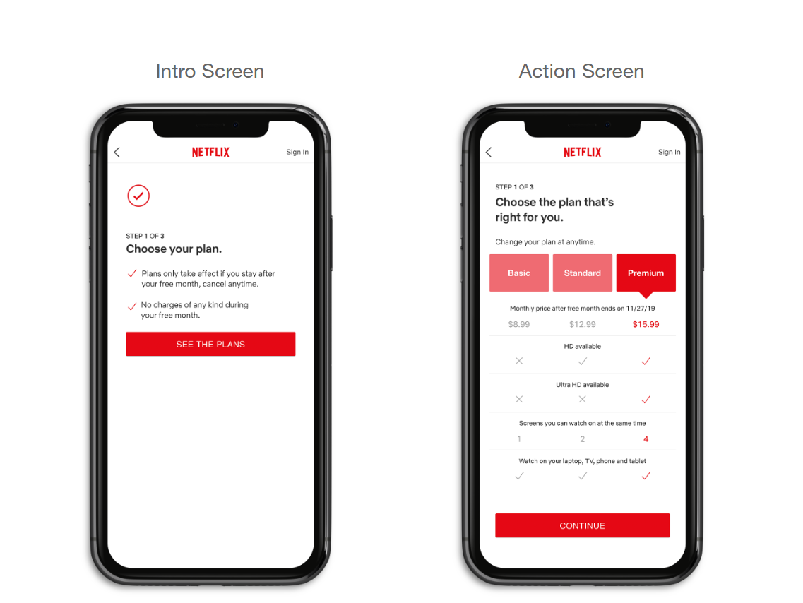
Including simple "Step _ of 3" progress indicators on each screen
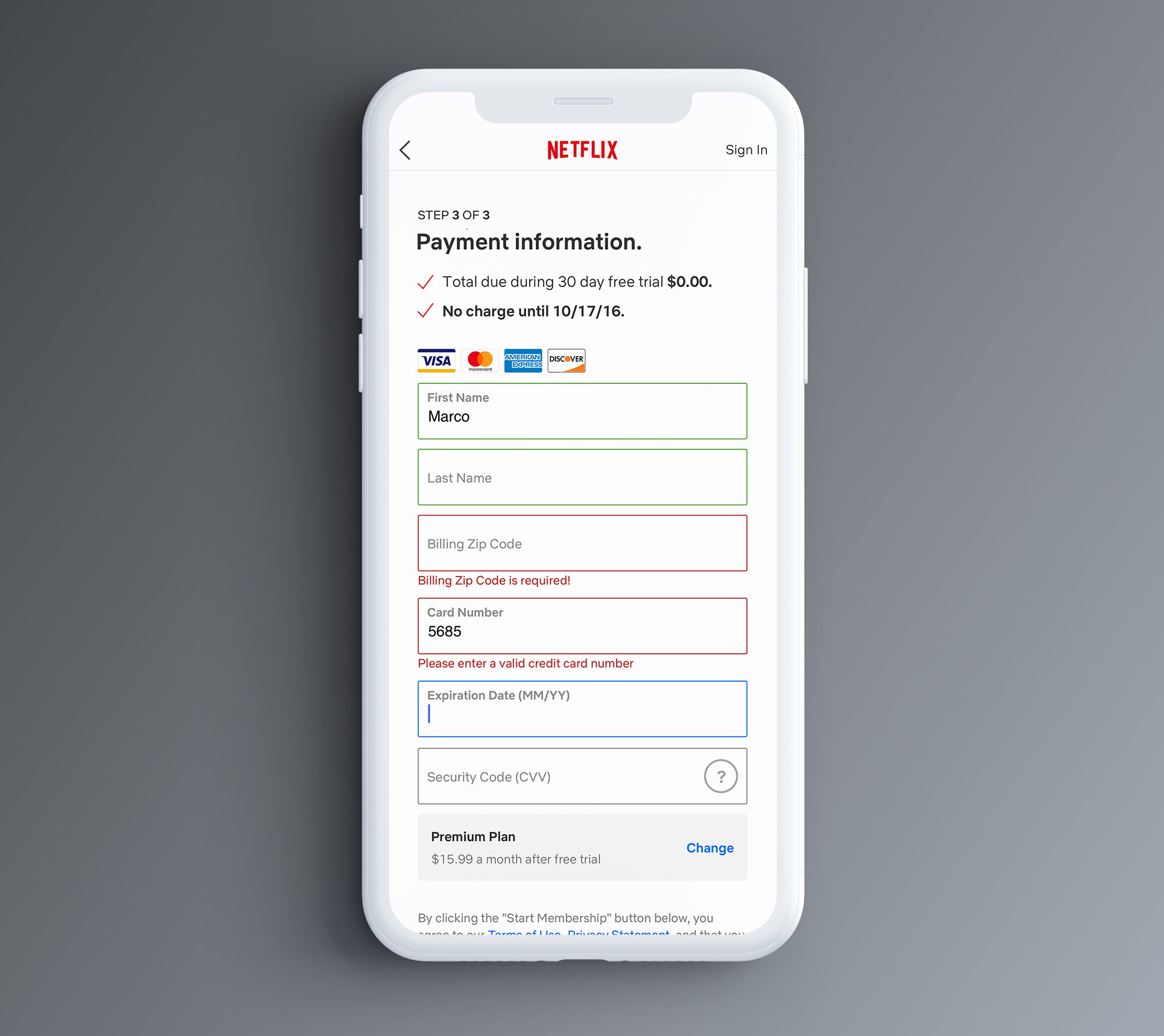
Incorporating modern text input fields with responsive information and clearer error messaging, designed as a scalable system for use throughout Netflix’s product
Rebranding the visual design of the sign-up process to be friendlier and align with Netflix's new branding
Establishing the foundation of a design system to accelerate future projects
Old sign up:
Email/PW input
Select a Plan
Input Payment
New sign up:
Intro - Login info
Action - Email/PW input
Intro - Plan info
Action - Select a Plan
Intro - Payment info
Action - Input Payment.
User Testing
I prepared various prototypes for qualitative group testing sessions. I created three designs:
Design 1: Included introductory screens
Design 2: Omitted the introductory screens (control design)
Design 3: Consolidated the entire sign-up process onto a single screen with minimal information
Design 2 served as a control for the additional informational screens. Design 3 reflected a solution preferred by other Netflix leaders due to an internal bias toward faster, minimal sign-ups. I valued its contrast with my primary design hypothesis. We also tested the original Netflix sign-up process as a control.
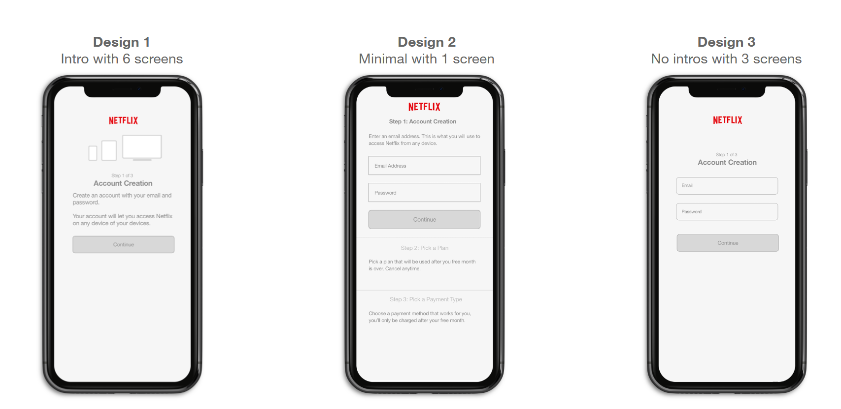
User Testing Was Clear: The findings were clear: The six-screen design (Design 1) with introductory screens best addressed user needs. Customers preferred the longer process with additional information. The other designs did not perform as well, particularly when compared directly to Design 1. This was one of the clearest "winners" I had seen in Netflix's qualitative testing, generating significant excitement and expanding resources for A/B testing.
Visual Design & a New Design System
I collaborated with and led visual designers toward two goals: designing a friendlier visual style for the sign-up experience and establishing a scalable design system.
After numerous iterations, internal feedback sessions, debates, and user testing, a clear direction emerged. The UX and visual direction laid the groundwork for creating various UI components that became the backbone of a new design system.

The Final UX Design


A/B Testing
I determined key design variables for live A/B testing across mobile and web platforms. Due to the strong qualitative results, we expanded the scope to include ten different design variables, which was possible thanks to Netflix's high weekly volume of customer sign-ups.
AB Test Groups:
Control/ current sign up
screen with minimal info.
screens with no intros.
screens with intros.
Groups 5 to 10 were variations of group 4 with different information.
A/B Test Results
The six-screen design emerged as the clear winner, with results surpassing expectations:
Sign-ups increased by approximately 9%. The test was repeated three times for confirmation.
All core and secondary metrics showed positive results.
In a post-mortem meeting, this was identified as the acquisition team's most significant metric increase in eight years.
A data team analysis conducted one year later revealed a $100 million revenue increase, accounting for users who maintained Netflix subscriptions for up to a year.
Final Thoughts and Conclusions
Current Use: This design remains Netflix's sign-up process across devices, with only minor updates. I later learned that other streaming companies, such as Tubi, adopted similar approaches for their services.
The winning design faced initial resistance from internal stakeholders who believed it was too long and advocated for a shorter, minimalist version. However, testing revealed this perspective was biased, prioritizing internal opinions over customer needs. This highlighted the importance of user-focused design, customer feedback, and iterative design.
New Systems: The project's scale allowed for the creation of a new design system that replaced an outdated one. It also led to a complete redesign of the text input system, which became standardized across the product, replacing redundant and outdated text fields on both mobile and web platforms. This system is now used throughout Netflix's product.